
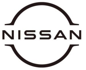
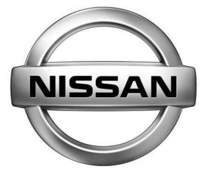
Nissan is considering changing the logo. This is evidenced by new trademark applications in the United Kingdom, Peru, Uruguay, Chile and Argentina. The new logo has become more minimalistic, abandoning the chrome trim of the existing corporate logo and three-dimensional form.
Instead, the new Nissan logo will be two-dimensional and monochrome, with the company name made in a serif without font and surrounded by top and bottom arcs with thin dots. It will retain the central marquee and round shape, but clearly evolves from the current, voluminous badge.
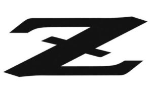
In addition, applications for a new Z-Series badge have appeared in Canada and New Zealand. The emblem is a letter Z, crossed out in the middle, and recalls the nameplate on the 1971 Datsun 240Z model.
We actually looked at the new logo for the first time when the Nissan Ariya concept appeared at the Tokyo Motor Show in 2019. Lighting on the electric crossover icon almost exactly corresponds to the new applications for logos, which makes us think that this will be the new corporate logo of Nissan, introduced in the near future.
Source: Авто Центр, Sostav